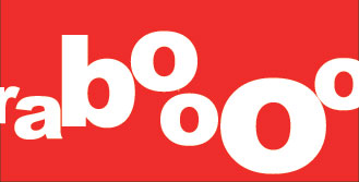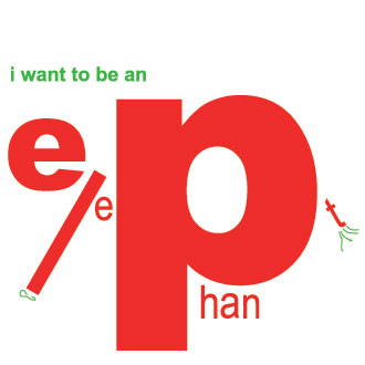
Anything But a Grabooberry is a book of nonsense verse for children aged 4-8 years that employs typography as word and image. Written by Anushka Ravishankar, and typographically illustrated by me, the book was bravely published by Tara Books in 1998. Working on the book was my first true foray into both typography and collaboration. In the process, I fell in love with both the ability of typography to convey ideas, and with collaboration as a method of engaging with creative practice.

Anushka is one of the most inspiring and easy people to work with. The poem she wrote for her daughter Akshara became the fodder for a book enjoyed by many children.
For an outsider, it is easy to presume that all books develop in the same way – text comes first, illustration next, design and production at the end. This rarely happens with independent publishers such as Tara. In this case, Anushka gave me the text simply typed out on an A4 paper. I began to experiment with different typefaces and tried to ‘visualise’ the ideas contained in the words. Some descriptions worked better than others. Anushka and I reviewed them together and she suggested other more visual words.
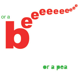
During this, I tested the pages out on several friend’s kids – their reading aloud of the typographic text on the page was an invaluable input. It gave the bee many more ‘e’s, and the grabooberry more ‘ooo’s… It was important that the design rather than being intended for adults was understood by the audience of children. There was a pleasurable to-and-fro designing and editing process. As Gita Wolf, publisher at Tara Books explains, ‘We found that children enjoy figuring out words like puzzles, since they have no pre-conceptions about this. Adults are not necessarily faster at comprehending it.’

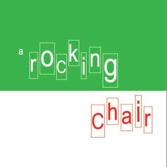
The typography in the book sets off associations in different ways: sometimes the word is a direct visual representation. For example, the word ‘cup’ looks like a cup. Other connections are indirect and lateral. A smelly sock is suggested through texture, a rocking chair is its movement, a bee creates sound, and the colour blue bubbles through water.
A simple, punchy verse that was so distinctly visual in itself seemed to ask for a simple, graphic treatment. I chose to go for a typeface with multiple weights. The only multiple weight typeface I had on my computer at the time was Arial and we certainly couldn’t afford to buy a new one so the decision was quickly made. The book needed to be low-cost – we couldn’t afford for this to be an expensive production. The book was printed on a single-offset machine in red and green. We simply worked with the restrictions we had and searched for inspiration within them.
Anything but a Grabooberry by Anuskha Ravishankar and Rathna Ramanathan was published in 1998, and reprinted in 2002 and in 2004. It won a White Ravens Special Mention in 2000 in the category of ‘World’s Best Children’s Books. The last time I checked there was only 1 copy available for sale on Amazon.

book design,children,India,typography,-
