
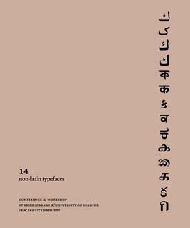
14 Non-Latin Typefaces was a series of posters created to celebrate a bipartite exhibition and two-day conference on ‘Non-Latin Typeface Design’, jointly hosted by St Bride Library, London and the Department of Typography, University of Reading.
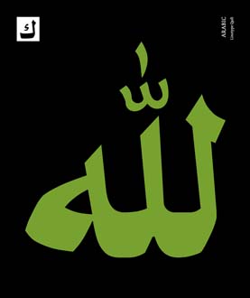
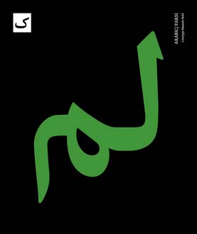
I worked on the project with the wonderful, hugely experienced typeface designer Fiona Ross. These typefaces were produced for Linotype in the UK, by teams headed by Walter Tracy in the 1970s and Fiona Ross in the 1980s. It is incredible to imagine that the beautiful graphic forms and non-latin characters you see below were each created and drawn by hand.
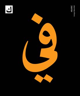
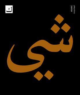
On the posters, we featured the same character ‘ka’ (often the first consonant in non-Latin languages) in a white box on the top left corner. This, along with the script and typeface titles on the top right corner provided an index that grouped the 14 posters together. The main character showcased on the poster was chosen both for its characteristic as well as its representative shape. I chose bright, bold colours to suggest the flavour and vibrancy of these scripts.
The posters were printed by silkscreen on black handmade paper by Arumugam and his team at AMM Screens in Chennai, India.
You can read Fiona’s paper on Non-Latin Typedesign at Linotype and a review of the exhibition by Eye magazine. You can also buy a copy of the exhibition catalogue from St Bride Library.
colour,language,London,Reading,typography,-