
This present website is the result of a collaboration between Joe Davis and myself. Previous to this, however, was a site designed and coded by me. The site went live in 1999.
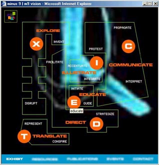
The spirit of the old site is much like the present one. It offered a choice. I call my design studio Minus 9 in reference to my eyesight. Central to the concept of the site was the idea of ‘vision’ (referring both to the name of the studio as well as the vision or mission of the studio). Visitors to the site could choose ‘normal vision’ which (like the name indicates) is a more direct way of accessing the work. Or you could choose ‘m9 vision’ which was my way of looking at my work.
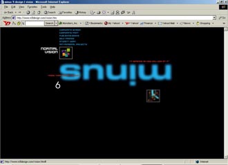
A key aspect of the design concept and narrative of the site was the typography. Words were all blurred (as they would seem to someone with short-sight) until your mouse hovered over them, at which point, the word would come into focus.
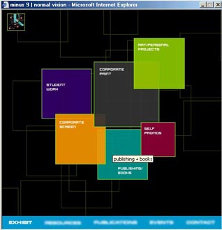
Clients interested in only a particular type of work (for example, publishing) could directly and quickly access previous projects.
brand,context,experiment,typography,vision,-