One of my first freelance jobs in London was with the independent publisher Pushkin Press. I came by the press on the Independent Publishers website and liked what they were doing which is publishing young contemporary writers and translations of European literature. I wrote to ask them if I could come by and show my portfolio and got an immediate email back that the publisher Melissa Ulfane was currently looking for a book designer. Serendipitous!
I thoroughly enjoyed my time working with Pushkin on their Classic series, and on their first titles in the Modern series. Melissa played a key editorial and creative role and was a hands-on publisher. In our first design conversation, she spoke of Pushkin’s visual identity and interest in continuing to use the typeface employed in previous titles.
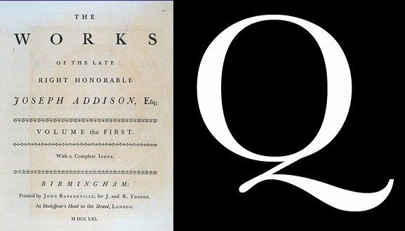
The typeface used in previous Pushkin titles is a transitional serif and a masterpiece. Transitional typefaces are so-called because they bridge the gap between old-style typefaces (low contrast) and modern typefaces (high contrast). This transitional serif, Baskerville, was developed in the 18th century by John Baskerville. The typeface is said to be the culmination of a series of experiments (including paper making and ink manufacturing) by John Baskerville to improve legibility.

My first step was to invest in a good quality typeface. As most graphic designers know, there are several revival versions of original metal typefaces. I narrowed my choices down to ITC New Baskerville designed by Matthew Carter and John Quaranta and a Baskerville revival by Linotype. I chose the version as digitised by Linotype which has six different weights and a reasonable but not overly emphasised contrast which made it perfect for both titling as well as long text typesetting.

I had two design responsibilities with Pushkin. The first, was to standardise the logotype and series titles. We kept the design stark and simple, focusing on the beauty of the typeface.
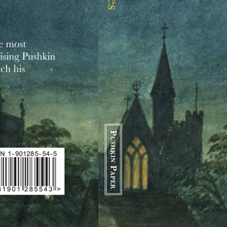
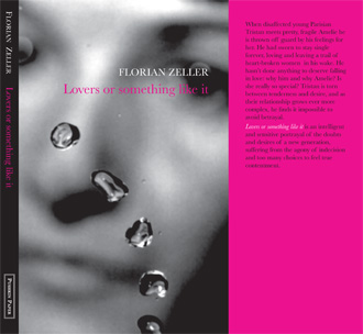
My second responsibility was for the design and production of the books which included everything from picture research for the cover to doing a final print check on site. Included below is an example of a typical Pushkin title page, and a few of the book covers from the Pushkin Modern and Paper series.
art,book design,literature,London,publishing,stock images,typography,-